peers. –
A digital platform for group therapy
peers. is an online platform offering professional mental health support. Through a thorough matching process they bring like-minded groups and experts together to help and support each other. Making therapy more flexible and accessible.
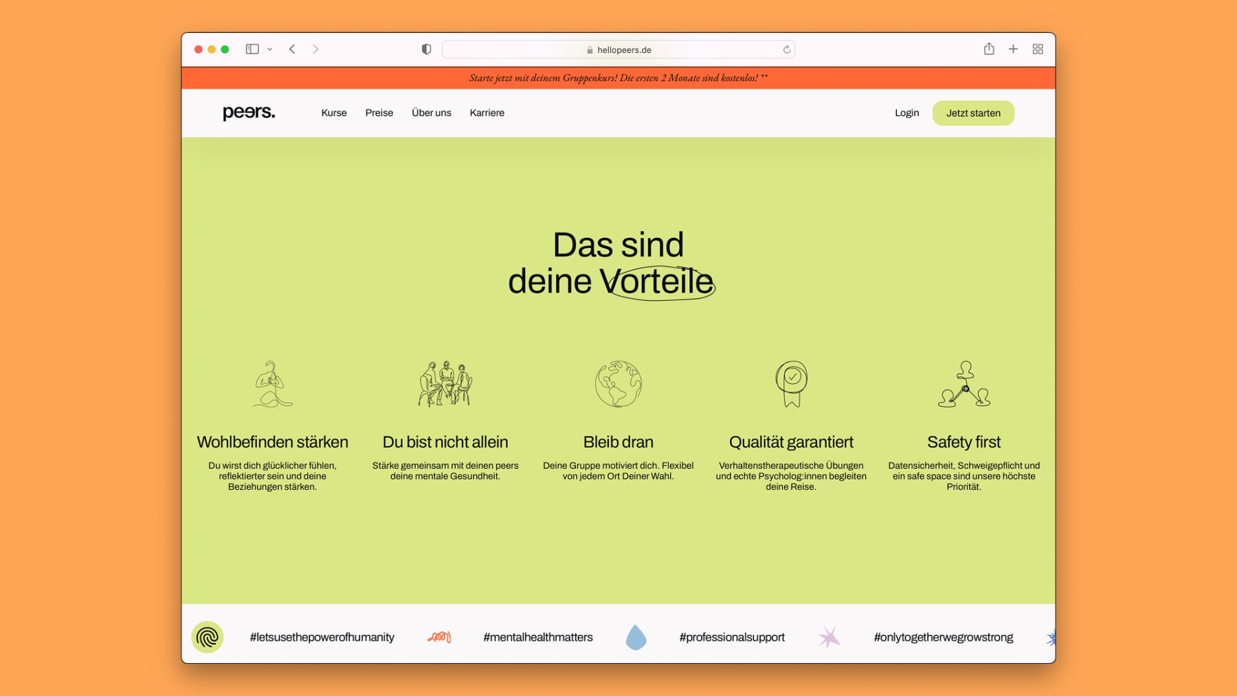
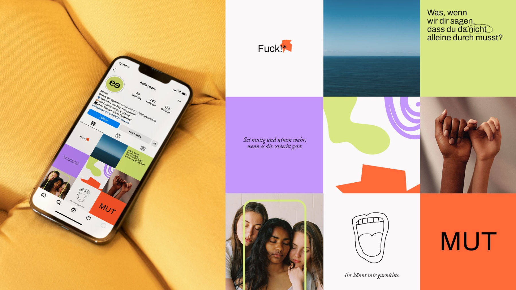
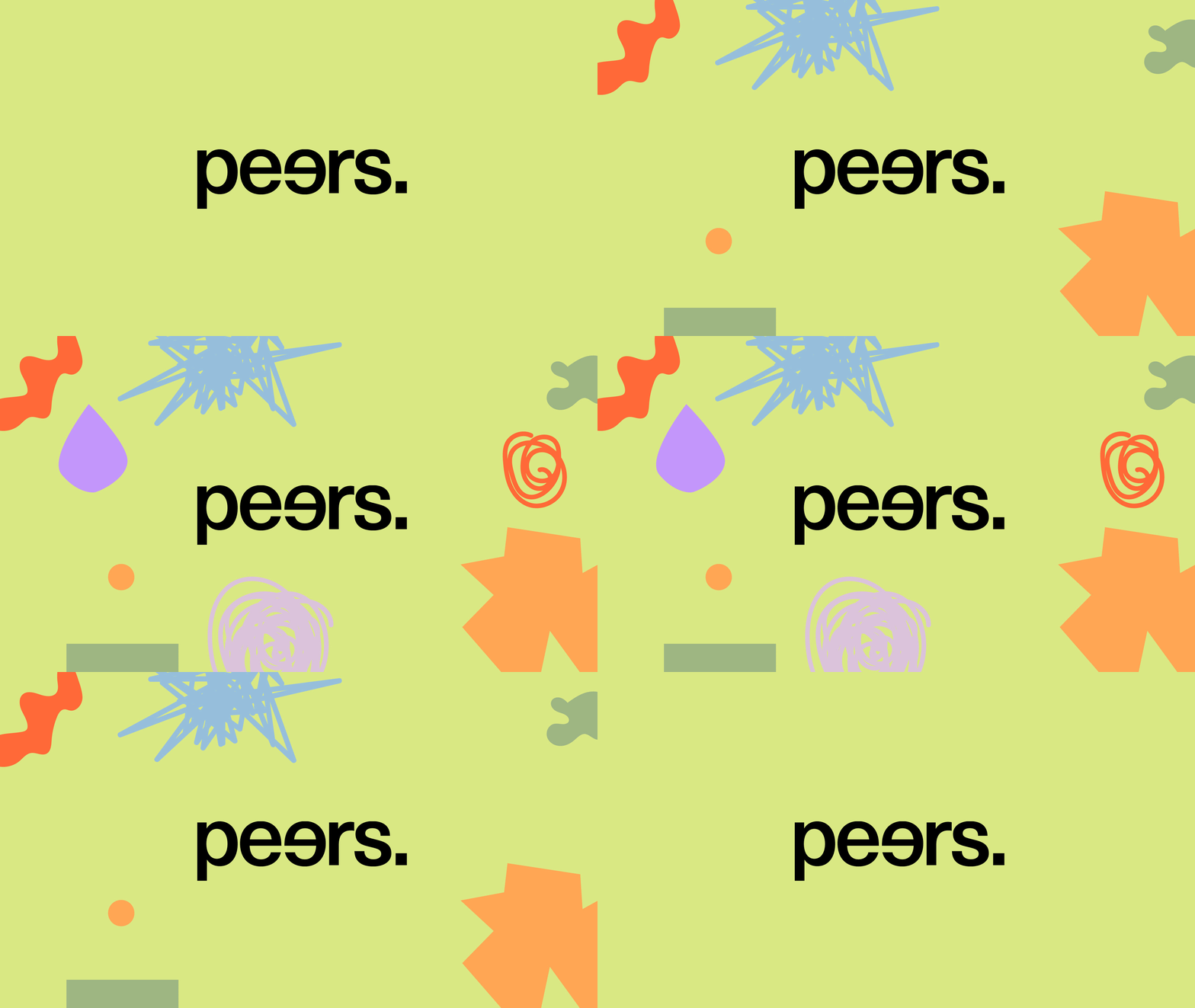
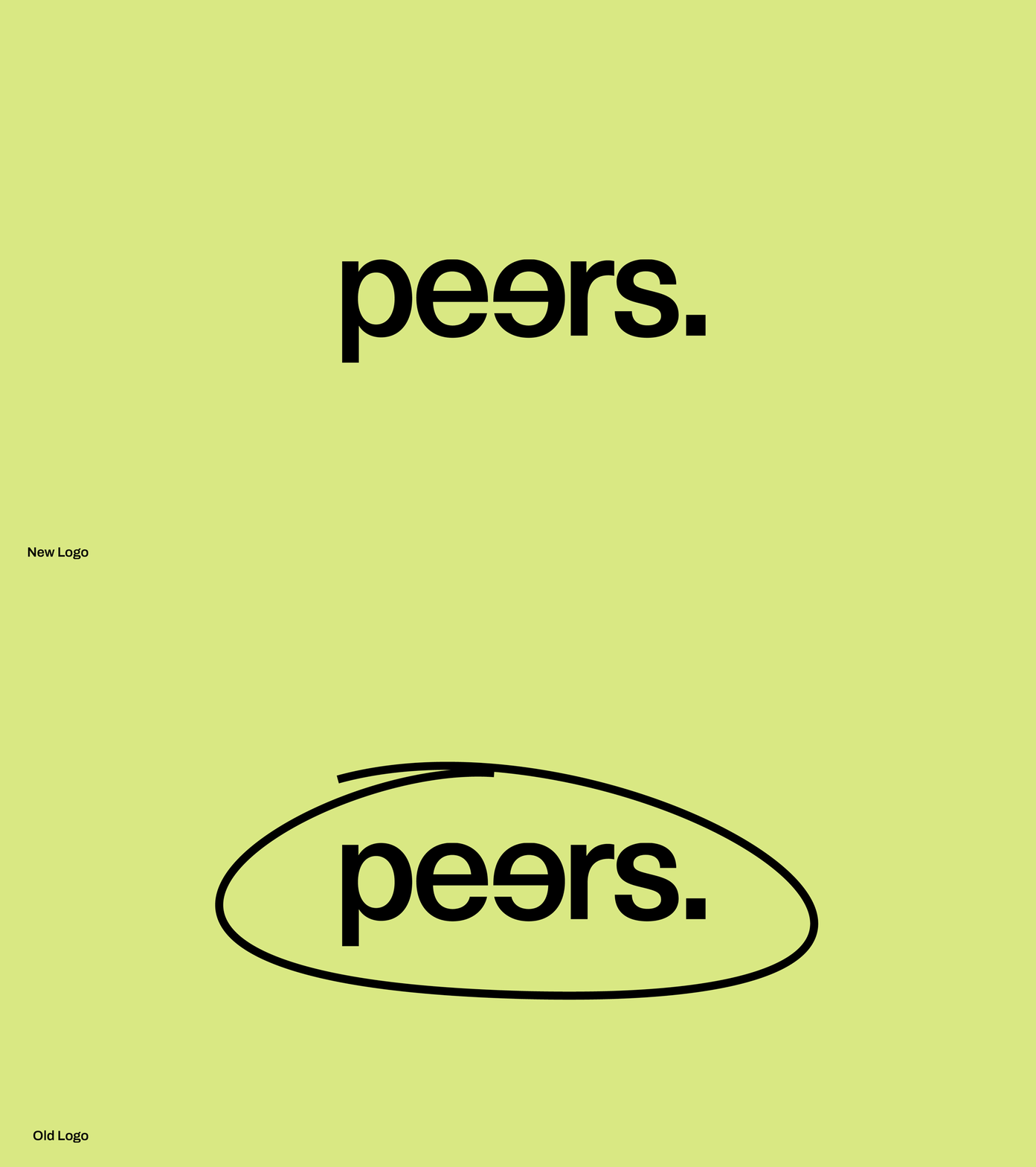
Through a simple rebrush of the logo and a rebranding of the brand's identity the design now evolves around a minimalistic wordmark within a colourful and warm world of soft imagery and emotional illustrations by Mimi Ganser.


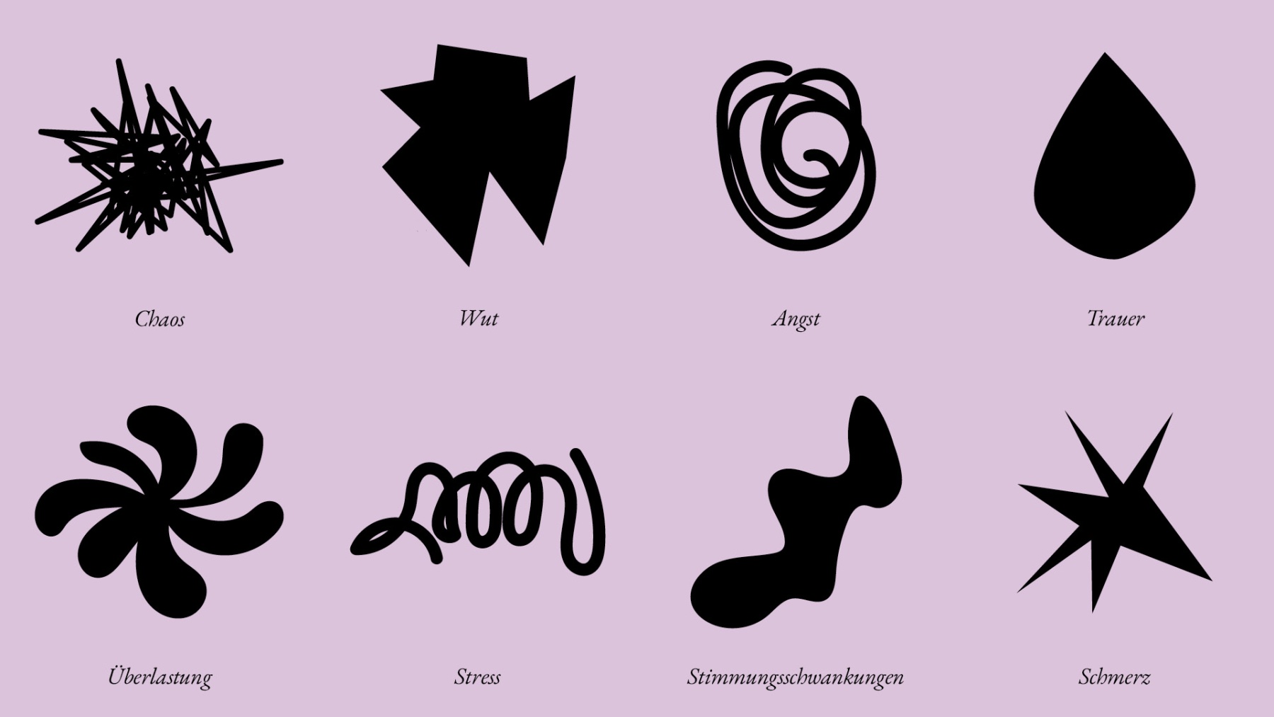
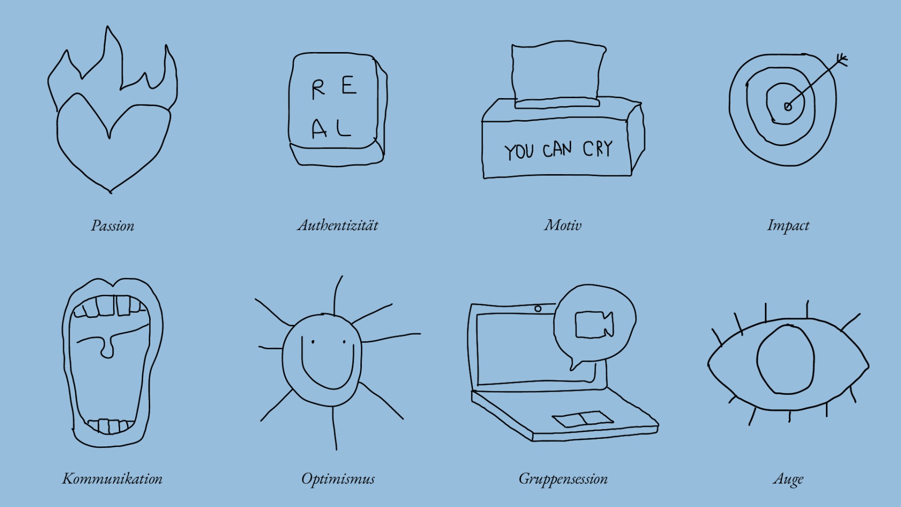
The images and the graphical world add to a brand identity representing emotions a person in need for therapy is dealing with. Together with illustrator Mimi Ganser we created two sets of illustrations: one visualizing unpleasent feelings as the starting point of a mental struggle and one cheering you up with graphical anecdotes. The various curves, contrasts and corners show that feelings come in many different shapes and colours. Never constant, always changing.


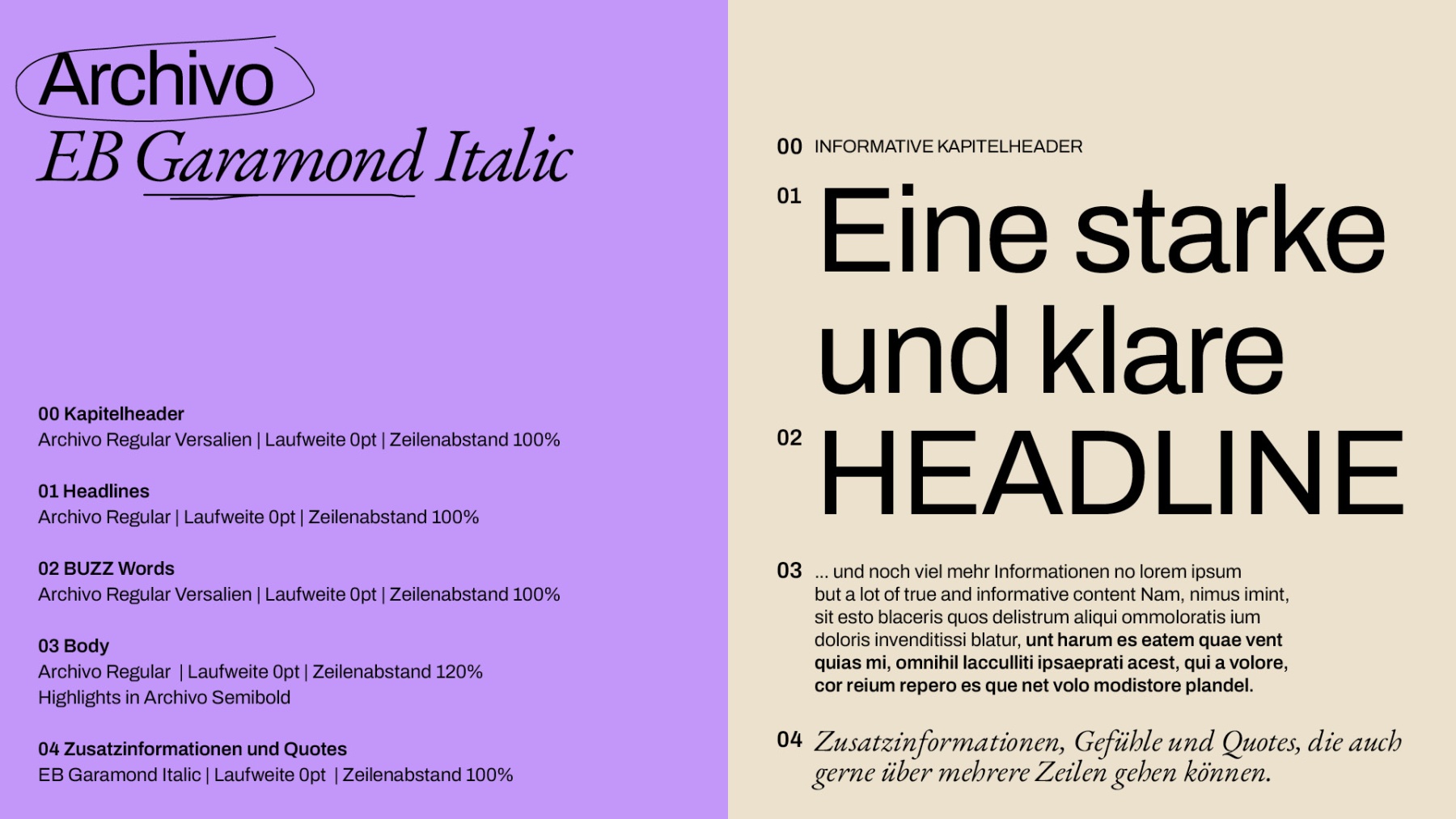
For an aesthetic font pairing we chose EB Garamond Italic as serif font and Archivo Regular and Semibold as grotesque fonts. The symbiosis of both fonts enables a hierarchical, playful handling of informations. The associated colour palette with its expressive titles supports the approachable character of the brand.
